The 3 Golden Rules of Product Placement
EYE LEVEL IS BUY LEVEL
But I bet you knew that!
Any shelf that’s at a customer’s eye level is prime real estate. It should be reserved for your best selling, high margin products or the new products that you’re wanting to promote.
It makes sense when you think about it, it’s the natural height where people look first. It’s the height that art galleries suggest you hang paintings, it’s probably the most packed shelf in your pantry because it’s the easiest to get to, and it’s where the most well known brands sit on the supermarket shelves. If your store charged rent, this products on this shelf would pay the most.
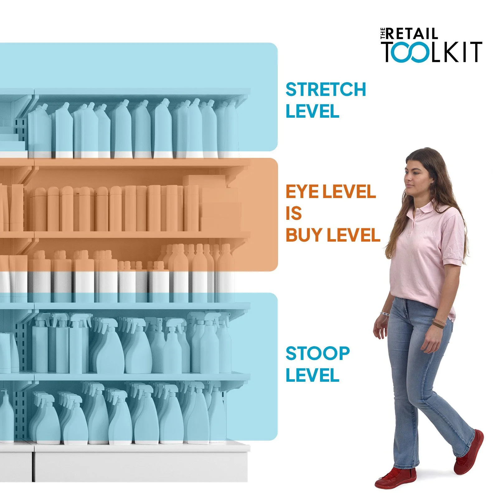
How do your shelves measure up? The average height for females in Australia is 161.8cm (5’ 3.5”) and for males is 175.6cm (5’ 9”). That’s not as tall as you might think.
What about the shelves? How do they stack up? Not so well, unfortunately. The area above the eyes is called the ‘stretch level’ and the area below is aptly called the ‘stoop level’.
STOOP LEVEL (Knee to Waist)
This is not a prime location. The products on these shelves aspire to go up in the world. Typically, the stoop level is used for:
Large, bulky or heavy Items: In grocery, that would be bags of rice, pet food or cases of bottled water to make lifting easier. In other stores it could be large bags, luggage, display baskets which are great with their handle on top - perfect for reaching down to test. Preferably aim for things that draw attention and look good from above since the customer is, indeed, looking down on them.
Budget or Store Brands: The less-profitable items, generic brands, and products with a low-price point are frequently relegated to the lower shelves.
Slow-Moving Inventory: Slow-movers are often placed on the lower shelves since they don’t sell as quickly and so low visibility isn’t a concern. However, you need to think carefully about giving any space to a slow-moving item unless it is offering some value to your sales.
Children's (and Dog’s) Products: Notable exceptions to this rule are products targeted at children, such as toys, colourful boxes of cereals and big bags of snacks. These are deliberately placed at a child's eye level to prompt pester power. But the same can also be said for dog treats and fluffy toys in pet stores. Dogs might not have the words, but they definitely know how to nag their pawrents for a treat!
Eye level is prime real estate for your best selling, high margin products.
STRETCH LEVEL (Above Eye Level)
These spaces are less accessible to customers, they may not even be able to reach them, but these high shelves could still be valuable display space if they’re visible from different sections of the store. Walk around to see where customers might be when they view these higher spaces and then use them for merchandise opportunities.
Excess Stock: This often includes duplicate boxes of items already on the shelf, they serve as a high visual display.
Premium or Niche Items: Sometimes, products with a high-end or luxury perception, like "top-shelf" liquor, are intentionally placed on higher shelves. Customers seem to associate looking up as quality.
Decorative or Displays: The top shelf is a great spot for large visual merchandising displays, signage, or decorative elements that enhance the store's theme without interfering with product accessibility.
Seasonal Displays: Items that are only purchased seasonally or aren’t usually essentials might also be placed on the top shelf to save valuable eye-level space for more popular products.
CUSTOMER’S DON’T BEND DOWN.
Perhaps another way of saying this is, ‘If they don’t see it, they won’t buy it.’
Customers are all about convenience. They’ve got their hands full with bags, products and possibly a toddler and they’re probably in a hurry. If the bottom shelves look empty from up high where their eye are, or they’re not that bothered if they buy it or not, they’re not going to go to the effort to bend down to look.
How do I know this rule? I first learnt it years ago when my production nursery supplied Bunnings. We would deliver trays and trays of sweet basil to the stores in spring - our absolute best seller, we couldn’t keep up. We would put some of the trays on the top shelf, which was at about eye level, and some on the bottom shelf which was at about knee level. You’ve probably seen these herb and veggie shelves yourself in the garden centre section. When we went back the next week to service the shelves, the sweet basil on the top shelf had all been sold, as had the front two or three plants on the bottom shelf but, if we bent down to look further back on that bottom shelf, there would be a bunch of basil plants that were now looking a bit neglected. The customers could only see the first couple of plants on the bottom shelf from where they stood but if they didn’t bend down or step back, they wouldn’t see that there were more basil plants to buy and they would walk away empty handed.
What does that mean for your retail business?
Your team must be vigilant about ‘facing’ or ‘blocking’ the products on the bottom shelves. This is a job to be done all day, every day. As your team moves around the store, they should be pulling the stock forward so that it can be seen by the customer when they’re looking down.
Stand where your customers stand to see what they see when deciding what to put on a bottom shelf. If it’s at the end of an aisle where they walk towards it and thereby see it from a distance, put large facing, colourful products there. If it’s at the checkout though, the customers probably stand too close to the shelf and are focused on the counter so perhaps use those lower shelves for reserve stock of products that are also up high as impulse buys.
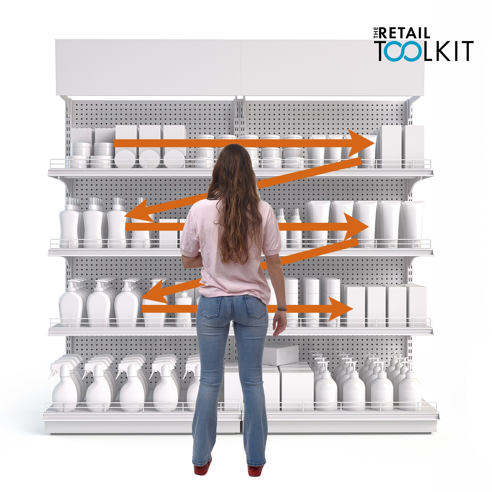
CUSTOMERS READ SHELVES LIKE THEY READ A BOOK
Human’s are creatures of habit. When a customer stands in front of a shelf of products, they scan from left to right and downwards in a z-pattern, just like they would if they were reading a book.
They start at the top left of their field of view, scan to the right, then their eye moves diagonally to the left of the next shelf down (probably the eye-level zone), and they scan to the right again. Their eye then moves diagonally down to the left again to the middle shelf and then scans to the right again.
Surprise, surprise. This is often referred to as the Z-Pattern.
This means that when considering the top spots for key product placement, the top-left and top-right are valuable, but it is the central "bull's-eye zone" (the eye-level area in the middle) that is the winner! And that’s where we do a complete circle back to the most important rule of all - "Eye level is buy level".
The scan width that a customer’s eye will travel from left and right of the “bull’s-eye zone” depends on a few things, including the aisle that they are standing in. Narrower aisles naturally cause a customer to stand closer to the shelf and it funnels their gaze more tightly, which is not necessarily ideal for browsing. Whereas wider aisles allow a bit more room to stand back which allows a customer to scan more broadly.
The product category itself also plays a part in how wide a customer will scan from left and right. The width of a category is a balance between offering enough variety to satisfy customers and not so much that it causes ‘choice paralysis’. For everyday, low-consideration products such as pens, gum or batteries, a narrow category block with fewer options is often effective because it simplifies the decision-making process. For high-consideration or "pleasurable" items (e.g. chocolates or cosmetics), a wider block with a greater variety of products can encourage browsing and exploration. In fact, with these categories the customer is likely to stop several times along the category, scanning in the Z-Pattern multiple times.
How do you use this information? It’s all about building vertical blocks within your shelf displays.
Customers read the shelves from left to right in a Z-Pattern, just as they would a book. Knowing this lets you tell them a product story.
Think of each gondola as one big vertical block, like the page of a giant book. You’re trying to tell a story so stand where your customer would and place the best sellers strategically in the bulls-eye zone (eye level & centred), then place the next most valuable products in the top-left or top-right of what would be the customer’s Z-Pattern.
Then, build smaller vertical brand & complementary product blocks within the larger vertical block. This way, you’re encouraging customers to scan downwards through similar product offerings but on a smaller scale - now you’re telling them a small brand or product story.
Avoid displaying similar products or brands in long horizontal rows as this forces the customer to walk. Ideally, they will be able to stand in one spot, and reach just about everything in the vertical block that you’ve built.
So, you will end up with several smaller vertical blocks within one large category block. For example, within one large category of shampoos & conditioners, you will have smaller vertical blocks based on their brands. If it was clothes, you might have a large category of jeans & t-shirts but within that the t-shirts will be blocked vertically, and the different styles of jeans each blocked vertically as well.
There’s an Exception to Every Rule:
It’s fascinating that the theory of the Z-Pattern is fairly particular to English-speaking customers because that’s how they read a page. However, in other reading cultures, their eye may move a different direction when they shop. A right-to-left reading culture still often scans in a z-pattern but the from right to left. A culture with a history of vertical reading may scan vertically, but globalisation and the wide-spread use of English may still be an influence.